
I recently worked with a client as she rebranded, and the most challenging part of the whole thing was choosing fonts. “I never knew there were so many! This could be a full-time job!” she told me, exasperated, as we poured through pages of fonts.
If you’re like this client, you may feel overwhelmed by fonts—and you may not even see the point of worrying about them. But fonts are your secret weapon for brand consistency.
Case in point: If I just show you these images, I bet you can tell me the company or product, or at least recognize it:


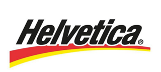

(In case you want to check yourself: Disney, Barbie, Energizer, eBay)
When you’re branding yourself, you want people to be able to look at anything, from your website to social media to print material and know it’s YOURS, even if it doesn’t directly have your name on it. And one way you can do that is to use consistent fonts. Those fonts can give instant recognition for your audience.
How many fonts do I need?
You want to consistently use no more than three fonts. These fonts will likely fall into three categories for a business: Headings, Subheadings, and Body Text.
Where do I start?
First, I would suggest looking at your logo for guidance. Ask your designer (or yourself, if you designed it) to determine what fonts are used in the logo. The font(s) in your logo are likely to determine the fonts you use elsewhere. You can either use the fonts from your logo, or you’ll want to look for fonts that compliment your logo.
(Note: If it’s time to rebrand, I suggest updating your logo before you worry about choosing fonts. Don’t base your fonts on an old logo. And most designers can help you identify fonts that will match or compliment the logo they create!)
Let’s look at Imprint Branding, for example.
Here’s our logo:
The fonts in our logo are: Carla and Benton Sans.
So, for us, the following makes sense:
Heading: Carla
Subheading: Benton Sans Medium
Body copy: Benton Sans
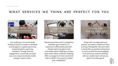
Here’s what it looks like on social media:

Here’s what it looks like in print:
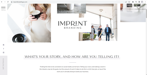
Here’s what it looks like on our website:
As we work toward consistency, we’re putting effort into making sure all our print and digital materials are using these fonts.
Sometimes there are exceptions, but, for the most part, you’ll want to stay inside your font family when creating any kind of text object. Customers will be able to distinguish your posts, your emails, your website from others because the fonts become recognizable and closely connected with your brand.
And while this may sound like a box you’re putting yourself in, let me say this: While it’s a lot of work to pick the perfect fonts, once you’ve done it, it takes so much guesswork out of designs and development!
So, is FONT an “f” word for you? Or have you become a kind of typophile like me?
Imprint Branding is tailored Social Media & Brand Management all in one. Contact us today!
Follow along on Pinterest.


")
")
")
")
")
")
")
